We had an idea to transform our dashboard. Clients loved our previous version, but it sometimes fell short of what they were trying to achieve. We were excited to work on a redesign to support the recent growth of our customer base. Our team was already shipping out new features to meet emerging needs.
But, we dove into it too fast and came up with solutions before considering the customer’s perspective.
Often we see organisations providing a solution without defining the problem. Assumptions are made on behalf of the user and time is spent on creating a solution which may not be right. Tech teams invest effort and resources to develop a robust platform then hand it off to sales who are ready to market a product that doesn’t fit their users’ needs.
We recognized that assuming users would readily adopt a solution with limited consultation during the building phase, fell short of what they needed. Users shouldn’t need to find ad-hoc ways to configure software to meet their needs. They shouldn’t have to teach themselves how to use a product. It should be intuitive and enjoyable.
Bearing this in mind, we researched design thinking principles to lead our new dashboard initiative – placing the user at the centre of the problems we were trying to solve.
The whole process breaks down into understanding the user, defining problems and use cases, ideating solutions, followed by implementation and testing. It’s an iterative process, which requires back and forth between steps to consider the user’s perspective at all times.
Of course, the result was to build an improved interface but we reversed our approach to bring in the user at the beginning, before brainstorming solutions right off the bat.
We asked ourselves, what value can we create for our users?
Step 1: User Discovery
Who are our users? What are their pain points and challenges? This stage aims to understand our users through interviews, observations, and user journey mapping.
Through context interviews with key customers and internal conversations with sales and customer success, we identified two separate user types: Data Analysts and Network Monitors. Each one had a unique set of needs.
User Research
Teasing information is not always easy. Especially when you’re limited to virtual interactions. We tested and iterated on different methods to reveal customer pain points and goals.
Without mentioning our dashboard ideas or potential features, we began asking them:
- Motivation/objectives
- Pain points
- Typical day and responsibilities
Asking open-ended questions with a loosely defined agenda let the conversation flow naturally. We began to build a rapport with our customers through empathy.
Once we built a deeper profile, we moved on to shadowing. Not asking their immediate needs but understanding motivations behind their objectives to design steps altogether.
Why do they take certain actions? Are they repetitive? Can we design that process out?
We also asked them about how they interact with their current tools. What do they like and dislike? How do they find information on our dashboard? What do they do with that information?
Receiving user feedback is tricky, you want to avoid putting interviewees on the spot. We found a natural balance between probing for answers and listening. Once they felt comfortable, we uncovered their habits and understood their decisions.
Use Cases: Putting the pieces together
By collating user personas and challenges, we mapped out use cases that overlapped. For instance, our users have implemented a new scheme to improve cyclist safety and would like to evaluate its success. Where would they start? How would they do that? What information do they need? What questions do they ask along the way? How do they present the results?
Connecting the user cases enabled us to form workflows for potential solutions.
Step 2: Ideation
The second half of the user-centred design thinking process is dedicated to collating our findings of the problem and the users we’re trying to help and beginning to think about solutions. As you’d expect there are a couple of steps, each with their own aims, techniques and outputs.
2.1 Workflows
“Map the steps a user will take when completing a common task”
Once you’ve mapped out what tasks users are trying to achieve, as well as why, you can start to plan out the steps required, and overcome pain points identified in the research phase.
For Data Analysts we defined typical use cases from feedback we’d gathered from the research phase. For example: viewing active travel trends over the last month. We decide that this would be a good opportunity to get employees from around VivaCity involved in the design process, to capture differing opinions and solutions and share the designing experience. Our Customer Success & Delivery team (CS&D) interacts with customers daily, putting them in an ideal position to help us stay in the mindset of our end users. To balance the selection of user-facing and technical experience, we also included engineers from our Cloud team.
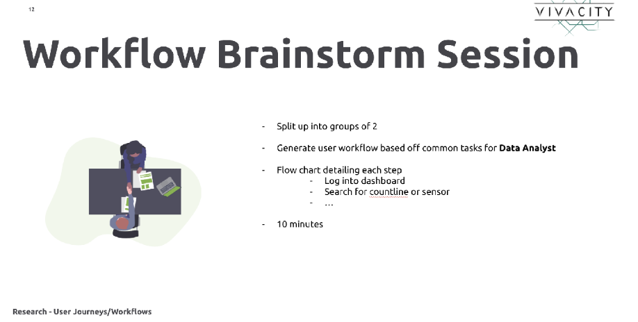
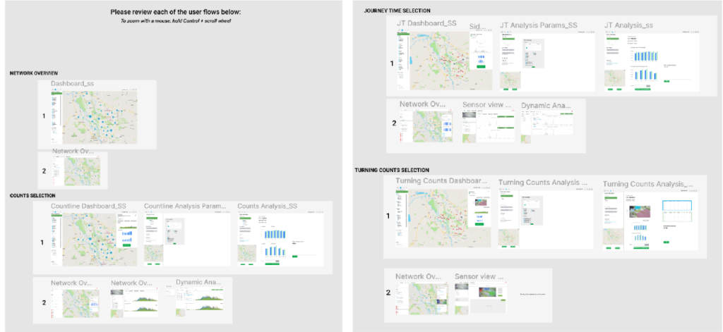
We held a brainstorming workshop where we mixed the teams and split them up into groups of 2 and asked them to create step-by-step flow diagrams detailing how a user might go about the given objective. Once the time was up, we rotated the groups and the workflows, giving people a chance to leave suggestions and comments on the other groups’ flows.
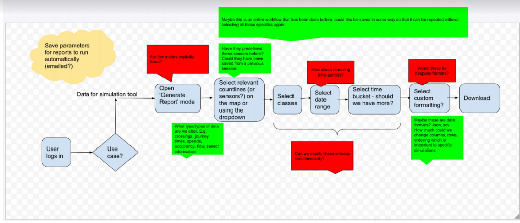
Then within the product team, we combined the workflows, adding and removing steps and flows based on the feedback. Now we have an overview of an ideal workflow for our Data Analyst, and how that might help to solve the issues identified in the research phase.
2.2 Wireframes
“Lay out bare bones content and functionality on a page based on user persona workflows”
Wireframes are an opportunity to start visually defining the interface a user might use when going about the common tasks. Using our workflows generated in the last step, we wanted to create low-fidelity prototypes that would illustrate how the UI might be laid out, and where certain interactions would take place. At this point, we’re not too worried about including real data, we’re just looking to get the structure defined.
We again opened up this exercise to the rest of the company and managed to get even more of our colleagues involved. We split into groups of 3s and presented the workflows with a specific objective, to start creating a basic UI.
Normally this sort of activity would work well given real paper + pens and a whiteboard, however, in the world of a global pandemic, we were confined to the digital versions: Google Meets + Google Drawings. Again we invited our colleagues from CS&D and Cloud but extended into Sales where we found another point of view as to what our end-users were looking for and the current challenges they face.
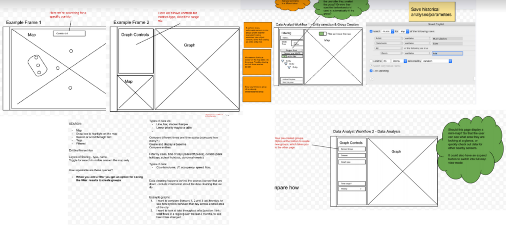
To ensure we were capturing all the important information in each screen, we extended this exercise within Product using a technique called ‘breadcrumbing’ (used at Basecamp). The aim here is to strictly define for each screen, dialogue and content section, what information would be displayed, the format of that information, and any interactive elements such as buttons and links. You then must explicitly define the result of clicking the button or link.
After mapping this out we found it was now very easy to relate back to our workflows created earlier to see if we had lost any important steps or visible information – if a user was presented with a real version of these wireframes and breadcrumbs, would they still be able to complete the objectives defined in the User Personas?
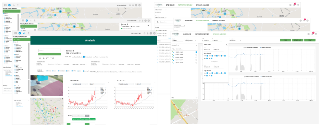
2.3 Mockups
“Present wireframes using more detail along with real information, data and interactions”
Once we have a comprehensive set of wireframes we have a good understanding of how our UI is to be laid out, and how a user might go from screen to screen and any dialogues needed to aid the user flow. The next step is to turn these low-fidelity designs into something much more high-fidelity, utilising real-world data. This allows us to see how the product might actually look once it has been created, and aims to expose any issues which might not have been encountered when creating the wireframes. Mockups combine the structure and process from the previous steps with real images graphics and UI elements.
They helps us define things like:
– How do we organise information on the screen? Knowing what information is useful to our users from the research phase, how best to easily and succinctly expose that?
– The visual hierarchy? How might the navigation around the application work? It should be obvious from a users’ perspective how to find different resources, and the UI should behave and respond in a predictable way
We undertook this in the Product team ourselves, creating 2 separate variants for A/B testing later. Starting with the wireframes and building them out with data and more detailed visual elements, we then worked through what the transition between the various elements and pages might be, and how they might enhance the user experience. During this step, we tried to ensure we were not taking any steps back from the current capabilities of the dashboard, but only moving them around and providing a good framework to introduce more complex features and analytical tools as well as surfacing more important high-level metrics.
As when creating the breadcrumbs in the wireframing step, we used the typical User Persona workflows to guide the creation, ensuring those important steps and objectives are still easily achievable. Defining a set workflow at the beginning also made it easier for testers to affirm if the designs were making it easier or harder for our typical users.
The user-centered design process is all about validation and interaction, so it was at this point we invited some of our users from the research phase to go through the mockups at their own pace, and provide feedback and suggestions of their own. We then scheduled calls to talk through their thoughts in more detail, attempting again to draw out the ‘why’s not just the ‘what’s, and feed this back into the next iteration of the mockups. We also gave our colleagues an opportunity to do the same – as they had been involved in the previous steps, we wanted to validate we correctly interpreted their wireframes and workflows.
We found this process extremely effective and rewarding – creating the mockups in a tool like Figma allowed our users and colleagues easy access to the mockups with a simple way to provide feedback. Giving testers the opportunity to step through the workflows in their own time enabled them to provide authentic feedback, rather than being put on the spot in a presentation type situation which we found can lead to rushed conclusions.
As with the other steps, we then took all the feedback and generated one final set of mockups. From this we were then able to hand off to the development teams and assist the technical breakdown of the new designs.
Looking back we found virtual brainstorming and researching challenging. But we were open to testing new methods to tease out information. We had an objective in mind to bring the user at the centre of the problem and adapted our tools along the way.
Getting our team involved in the design process was the most rewarding.
Thanks to everyone who participated in shaping our new dashboard!