Introduction
We have released a new analysis of social distancing adherence to support researchers, local authorities, and government in decision-making around relaxation of current Covid-19 rules.
There are widespread concerns about the economic impact of the UK’s current social distancing rules, intended to help prevent the spread of the coronavirus. With countries such as France and Denmark following World Health Organisation advice for pedestrians to remain 1m apart, the UK government has faced calls to reduce the burden on retail and hospitality industries by relaxing the 2m rule.
Understanding people’s current social distancing habits, such as locations in which people are most often less than 2m apart, is key to understanding the effectiveness of existing guidance and evaluating the impact of future changes. We have leveraged our extensive nationwide sensor data and award-winning artificial intelligence technology to analyse compliance with the 2m distancing guidance and the risks associated with a relaxation of this rule.
(Our sensors do not collect personal data, and none of our clients can use our technologies to gather any kind of personal data).
How did we gather and analyse this data?
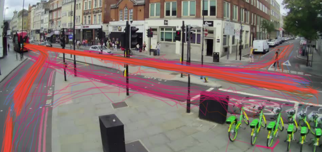
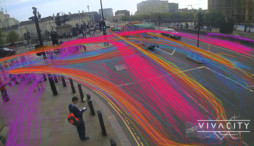
Our smart video sensor devices are used to capture, classify, and track pedestrian, cyclist, and vehicular traffic around the UK. This represents a level of data granularity unique to Viva, in which road user paths can be traced over time. By measuring the distance between individual pedestrians, we have been able to provide central government and mainstream media with analysis of the number of <2m interactions between pedestrians for different times and locations.
363 sensors from locations around the UK are used, covering a range of cities including London, Oxford, Manchester, Cambridge, Liverpool and more, and a range of area types, including city centres, residential zones, business/retail parks, and canals.
Crucially, everything that has been done is anonymous. Our sensors gather data on the passage of different road users, working out the paths that (for example) pedestrians are taking – and discarding all the underlying video data. We don’t know that it’s Jane & Abraham who have skirted around each other at 2m – we just know that two pedestrians took these paths. Aggregating over an hour, you get pictures like the below, showing everyone’s paths (including, in this case, cyclists in hot pink, pedestrians in purple, and motorised vehicles in the other colours) without any personal data.
What does the data show?
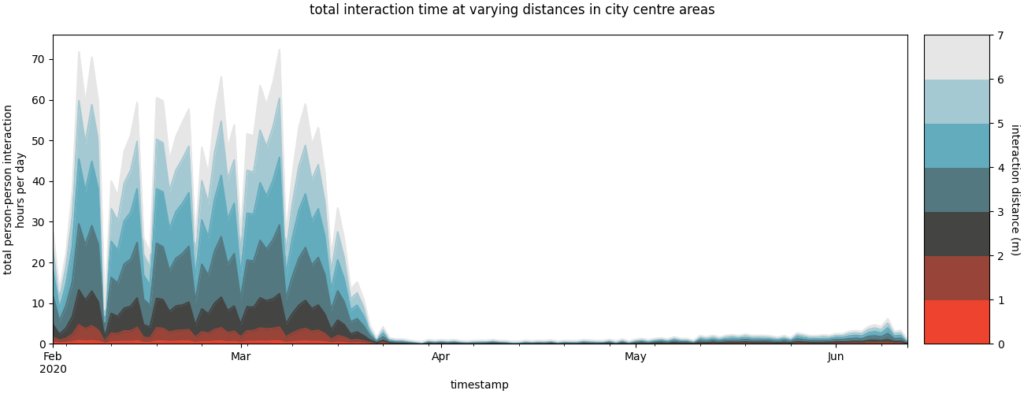
The first thing to note is how dramatically all interactions have been curtailed since lockdown. The below shows city centre interactions since early February – and demonstrates quite how effective lockdown is at reducing interactions. Even the protests on 6th/7th June are only visible as a small increase vs pre-lockdown figures.
City Centre: Total Interaction Time by Distance
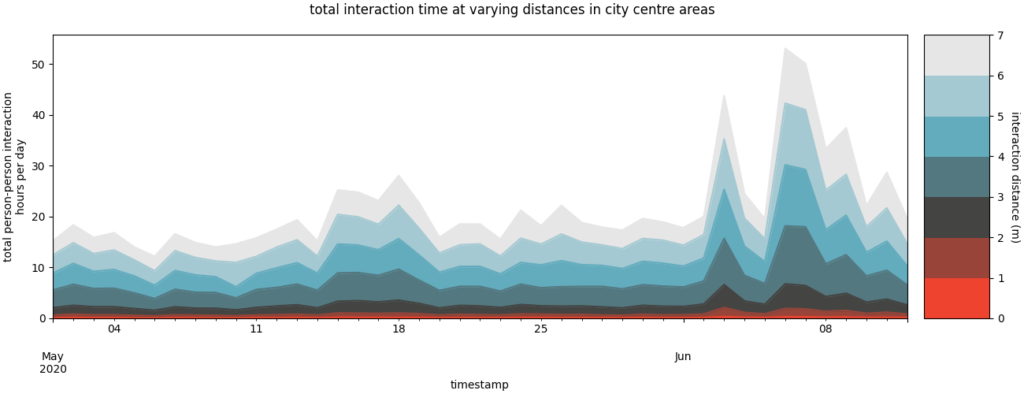
However, zooming in on data from 1st May, it is clear that 1) overall interaction volumes in city centres have been increasing slowly even without the protests, but also that 2) the protests caused a notable spike in interactions. Note that this uses additional sensors on which the path tracing required for social distancing was only activated after lockdown, so the scale is different vs the previous graph.
City Centre: Total Interaction Time by Distance (May onwards)
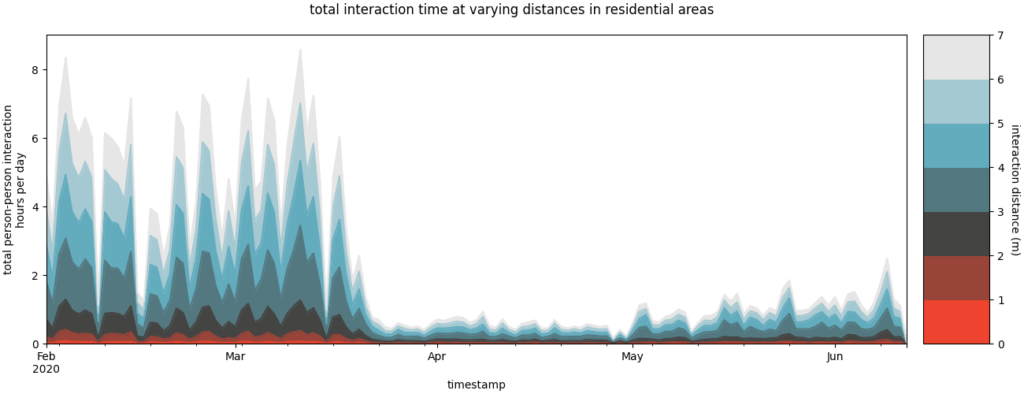
City centres aren’t the only places where people interact. Residential areas have seen a similar trend, if less severe. However, rural canals have seen the opposite trend – the beautiful weather this spring has led to a substantial increase in the number of interactions after lockdown.
Residential: Total Interaction Time by Distance
Rural Canals: Total Interaction Time by Distance
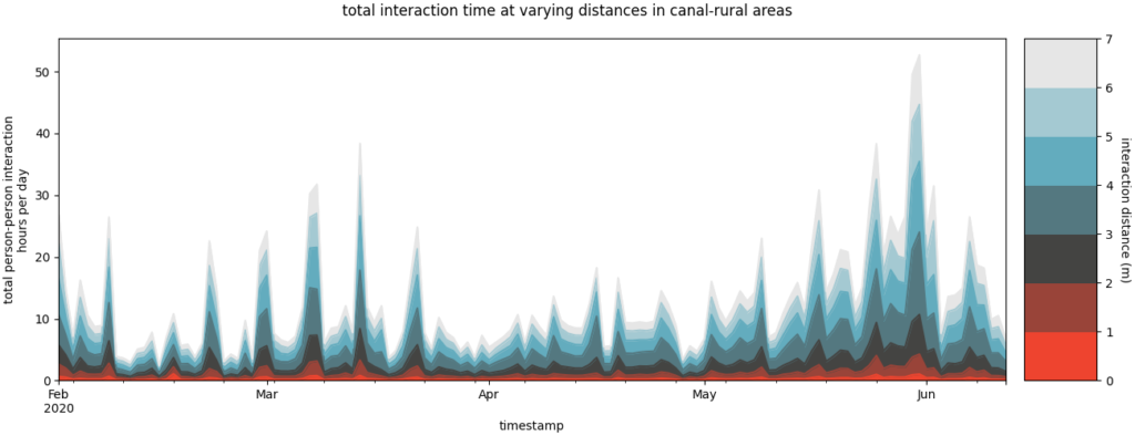
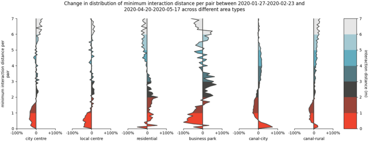
Looking at the delta between these graphs demonstrates this point more clearly – it becomes obvious that there has been a decrease in close interactions at <2m across most areas. Residential shows a slight increase, which may be due to imperfect filtering of household groups out for a daily walk. Meanwhile, canals show a decrease between 1-3m, but typically a small increase at very close distances of <1m, most likely as a result of the increase in overall flows in a very confined space forcing some close interactions.
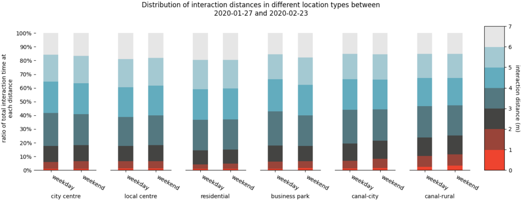
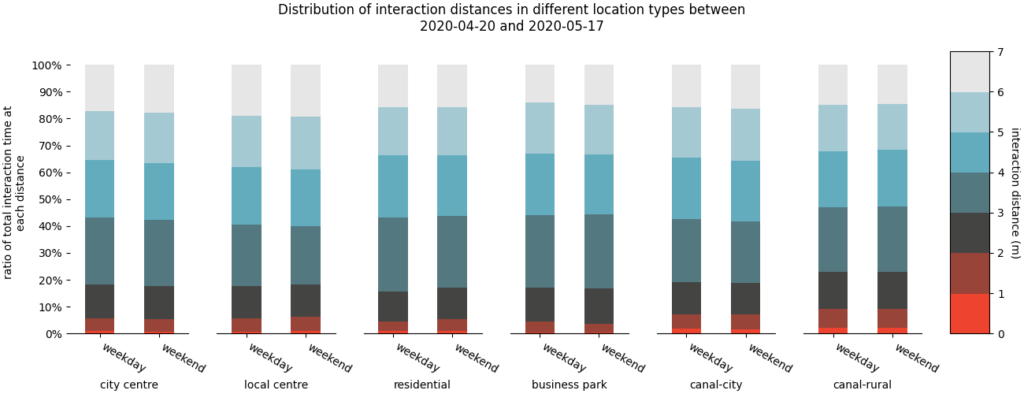
In terms of the proportion of time spent at different distances, superficially it looks like there has been relatively limited change between pre-lockdown and the most recent weeks. Most locations experience c.10% of interactions at <2m both pre- and post-lockdown.
However, this is very misleading, because post-lockdown so many individuals walk past our sensors with no interactions at all. An initial analysis shows that the number of interactions in city centres has declined to c.5% of previous volumes – whereas the number of pedestrians in city centres is c.25% of previous volumes. This relationship would be broadly expected, with interactions decreasing much faster than the number of pedestrians. To look at this another way, from our data in Oxford city centre only, pre-lockdown we saw that 30% of the time any pedestrians were in view, there were multiple pedestrians; whereas post-lockdown this had dropped to 16% – approximately halving anyone’s opportunity to interact. These simple scaling factors demonstrate the power of lockdown even without any kind of social distancing.
Pre-lockdown Time Spent at Different Distances
Post-lockdown Time Spent at Different Distances
Looking specifically at the minimum interaction distances, we can see a significant difference between pre- and post-lockdown. The pre-lockdown figures show a peak at ~3m, but a secondary “hump” between 1-2m, with interaction distances only dropping off rapidly for <1m, where people would be almost shoulder-to-shoulder. However, post-lockdown, this became a much more linear reduction below 3m, such that the proportion of interactions between 1-2m is much lower. This demonstrates a marked effort by the population to avoid these close interactions – although also shows that these can be difficult to avoid completely. Rural canals are perhaps the most challenging environment here, where pre-lockdown the peak interaction distance was ~1m; post-lockdown, 1m interactions are still common, but many interactions have been pushed to larger distances of 2-3m. This is visible, if only just, in the previous graphs of time spent at different distances – where the <1m distance is almost invisible in the post-lockdown graphs, except on canals, whereas previously it still represented c.2-3% of time spent interacting.
Pre-lockdown Interaction Distances
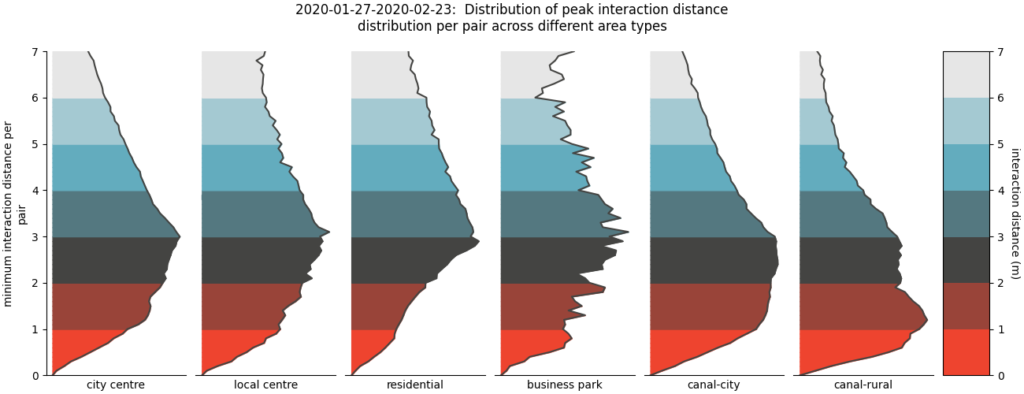
Post-lockdown Interaction Distances 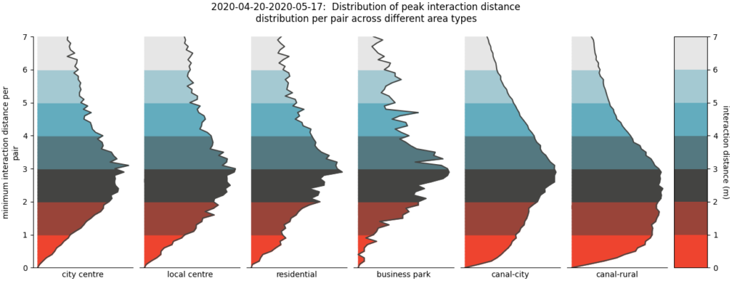
Distribution of peak interaction distance distribution per pair across different area types
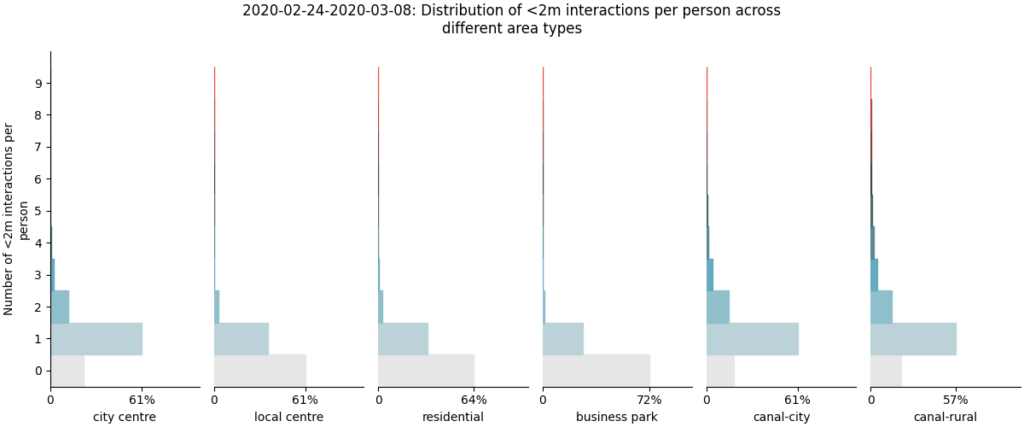
Finally, we looked at whether it was a small percentage of individuals regularly violating social distancing, or everyone being slightly lax. It is clear from the data that the number of people with multiple <2m interactions within a single camera view is extremely small across all areas except canals. As such, it looks like people are broadly adhering to social distancing, with most of the close interactions coming from small, brief slips, rather than wilful & repeated interactions. Behavior is typically quite different on the canals, where the narrow footpaths make distancing impossible, and so we see many more individuals having multiple <2m interactions. However, please note that we can only analyse this within the field of view of a single camera, and so an offender would need to be quite aggressive with their social distancing failures to show more than a few <2m interactions within the 30m of street that each camera can typically monitor.
Pre-lockdown: Adherence to Social Distancing
Post-lockdown: Adherence to Social Distancing 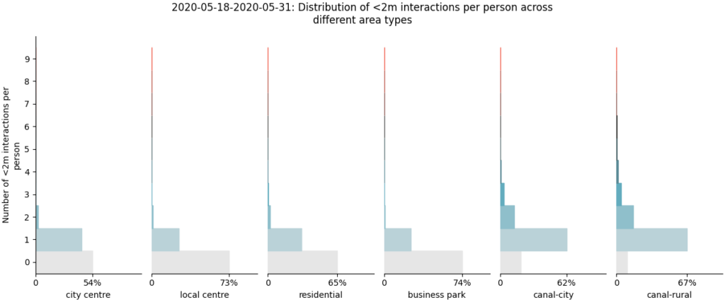
See our animated GIF below to see changes over time more easily

How representative is this data?
To produce this dataset, we have used 363 sensors from across the country, representing a wide range of scenarios. Of these, we have used 107 in residential areas; 81 in local centres; 67 in city centres; 67 in rural canal areas; 24 on city canals; and 17 in business parks. Combined, we calculated over 2.3 billion distances between two pedestrians, and measured 320 million separate interactions between two individuals – showing the huge scope of this kind of data.
However, there are limitations to any analysis, particularly one that was drawn up over a couple of days to feed into the time-sensitive debates happening in the press & public sphere. We would like to highlight a number of caveats to this data to anyone who is looking to use it in further analysis:
- Every sensor is outside, on the streets. As such, we do not gather data on what is happening inside shops, offices, or transport hubs, which may be experiencing very different behavior.
- All distances are measured between centroids of individuals (specifically, from the point between their feet), rather than shoulder-to-shoulder. We feel that this is a good representation of the likely distances between faces, but depending on the precise definitions used in epidemiology there may be a systematic adjustment required here
- All distances are measured by performing perspective transformations on video feeds. These introduce a level of inaccuracy, particularly when combined with small inaccuracies in position due to definition of the outline of a person in the machine learning models. As such, we would emphasise comparative trends & differences between times over the absolute distances, although averaged over a dataset this size we believe that these will be reasonably accurate.
- All data is subject to the caveat mentioned previously that the analysis has been focused on interactions, and so pedestrians walking past with no-one nearby will not contribute to the percentage figures.
- We have applied filters in an attempt to account for household groups walking together – specifically, if two individuals are walking <3m apart for 60%+ of the track we measure, then it is assumed that they are a household, and they are eliminated from the dataset. This is a relatively crude assumption at this point in time, but is required to eliminate a systematic bias we have previously seen when trying to analyse this behavior. It will eliminate anyone who stops to have a chat with another household at less than 2m – and so the next stage in improving this will be to look at direction of travel.
We are currently working on an InnovateUK R&D grant focused on social distancing, which should allow us to systematise and improve on some of these assumptions, particularly assumption 4. However, for now, please take the above into consideration in any further discussion about this dataset.
Conclusion
Government advice has been very clear – we all need to maintain social distancing in order to keep R values below 1. This data demonstrates quite how extreme society’s lockdown has been, and that we as a society have radically changed our behavior, with city centre social interactions decreasing by more than an order of magnitude. However, the differences are mostly caused by the overall decline in volumes, rather than extremely good adherence with a 2m rule. Behavior on the streets has changed, but is a relatively small component of the overall reduction in interaction time & volume.
How this will evolve as the lockdown is gradually lifted is a question for another day. From this data, it seems that encouraging people to stay away from the centres is likely to be having a much larger impact on R than the behavior change due to the 2m rule.